Ollie Quinn
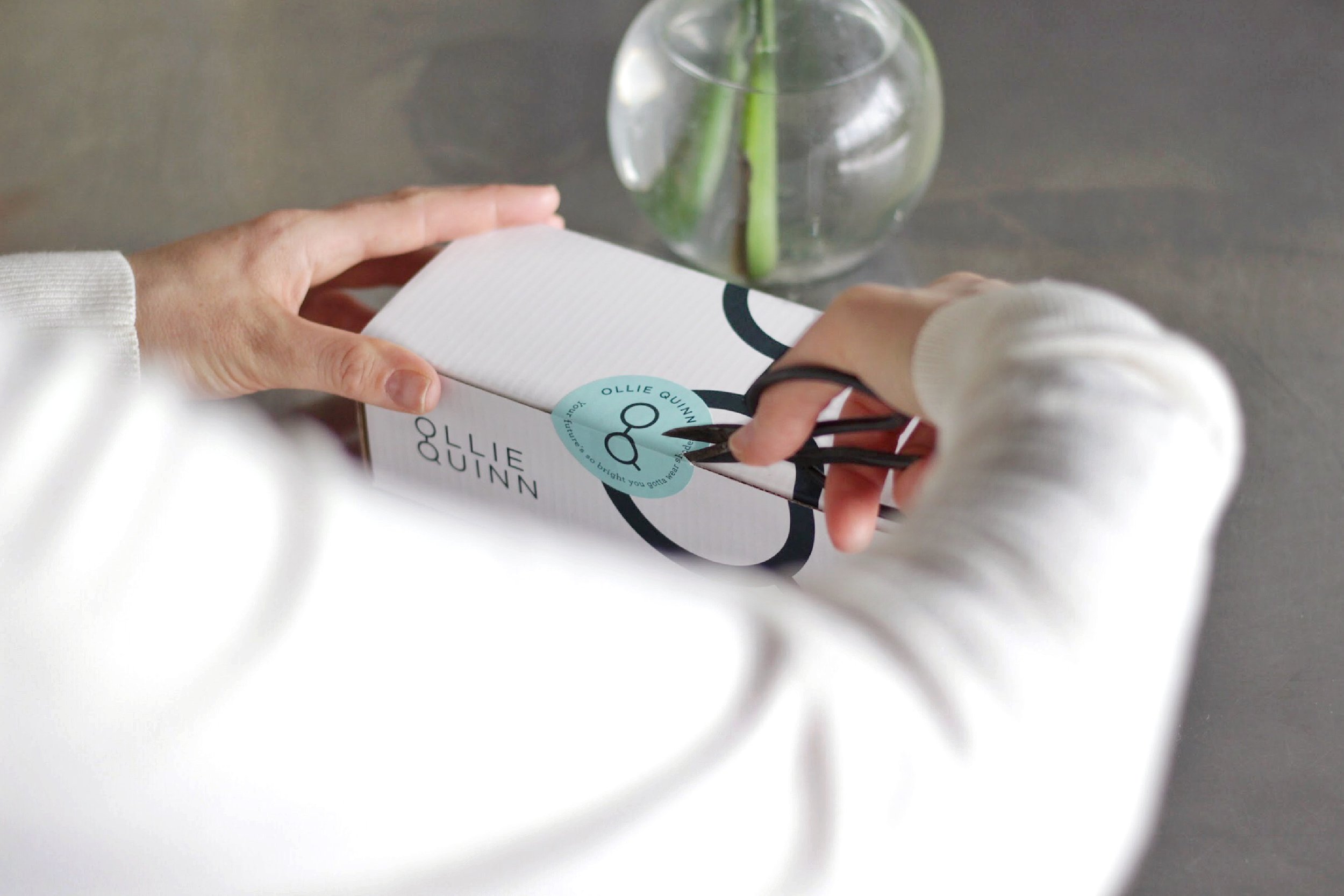
The Ollie Quinn logo was designed to feel modern, minimal, and subtly clever. A clean, geometric typeface gives the wordmark a contemporary and approachable feel, while the stacked “O” and “Q” introduce a distinctive visual element—a subtle nod to eyewear that reinforces the brand’s core offering without being overly literal. The aim was to create a mark that feels stylish and confident, with just the right amount of personality to set it apart while remaining versatile across applications.
_________________
Identity Design / Packaging / Signage / Email Campaigns / Website